Showing posts with label Comic book Review. Show all posts

Monday, February 26, 2007

Tony Loco #2


The second issue of Tony Loco takes us deeper into the mind, psyche and the mental institution that houses Tony and other patients of the mentally unstable.

Layer upon layer of Tony’s past is slowly revealed. We catch glimpses of what perhaps will the unveiling of the reasons for his catharsis. Most of the officials and workers have no genuine concern for its patients run the mental institution. The only staff member that cares for the patients is Janice Evans.

This issue was definitely a trip. Most journeys into the mental psyche of a character can be difficult to follow. Throughout the book, there are glimpses to events from Tony’s childhood that, while possibly meaningful to creators who know their characters intimately, may be portrayed in a manner that unintentionally leaves readers a bit in the dark. The danger with dealing surreal elements at times, is that there can be a disconnect of sorts where the audience can get lost and be left more puzzled about a character rather than knowing more about him...(Read the rest on TheComicsReview.com)

Saturday, February 24, 2007

Purity #2


Purity #2 picks up where the first issue’s cliffhanger left us. The Four Horsemen have come to Earth looking for an item of the utmost purity that can grant untold and unimaginable power to its owner.

I love a good battle of biblical proportions…especially when characters that pre-date creation settles upon our planet to duke it out. The artistic line-work of Andres Guinaldo is an absolute gem to behold. His artwork draws out from readers a mixed bag of emotions. One minute you’re marveling at the delicate line-work and detailing involved in creating each panel. The next minute, you’re raising your eyebrows at the very same aforementioned details that delineate death, destruction and depravity on such a grand scale. This is a comic book done in widescreen without the double page spreads. I’m amazed at how much mayhem can be portrayed in one page much less the entire book! Make no bones about it: this is high-octane violence depicted with broad and grandiose strokes that the story seems to burst from its pages!

Keep in mind, folks…the artwork is in black and white. Can you imagine how horribly beautiful these pages would be when in the hands of a gifted colorist? I think my head would explode!

Little by little, writer Shawn Lewis reveals more and more of the reasons behind the fantastical war between light and darkness with a good measure of gray in-between. I’m still a bit wary about hell’s agent, Abigor… you just never know if she could turncoat so easily.

I love (writer’s) re-imagining of biblical characters and elements and transforming into the 21st century. From heaven and hell’s agents to the desperately sought-after relic, his unique ability of pulling fascinating lore from between the chapters of the Bible is refreshing and bold.

This book easily ranks 10/10!!!

Sunday, January 21, 2007

"a bit Haywire" Graphic Novel


And the hits just keep on coming…! Honestly, the folks at Viper have got some kinda voodoo goin’ on…I haven’t read a bad issue from their stable of books yet.

Courtney Huddleston has put his masterfully, ingenious storytelling skills into a book that harkens back to the old-school, family-friendly books of yore and created a tale of youthful heroism in a character for the new millennium. The book is wonderfully produced as a bite-sized graphic novel that makes use of chapters broken down to appropriately progress the story along. Huddleston’s super-kid has tremendous powers he inherited from his parents. But, rather than having a smoothly packaged set of powers that are exercised with expert ease, Kyle’s powers emerge in a rather out-of-whack fashion.

For example, he can fly, but his ability to fly only works if his eyes are closed! This makes for some rather madcap mayhem in the skies. Kyle discovers other powers that are initiated by some unusually unorthodox methods. Courtney has hit upon a premise that humorously depicts the discovery of new powers in a unique light. There hasn’t been a more humorous discovery of newfound powers since Tobey Maquire’s Peter Parker declared “Shazam” in the first Spider Man movie. Seeing Kyle’s attempt at disguising his identity by tying a towel around his neck with an embroidered “Hers” in the back; along with a ski cap and domino mask. Oven mitts, over-sized socks and underwear appropriately worn on the outside further highlight Kyle’s taste in super-heroic sartorial garb. What comic book reading kid hasn’t attempted this in their youth? (Read the rest from TheComicsReview.com HERE)!

FireBlast Adventures in the 30th Century Issue 0


Fireblast Issue 0 introduces readers to Mack Fire on his inaugural opening of Fireblasts Investigations. The first day starts off auspiciously with attempts at Fire’s life before he’s even had a chance to put the “Open for Business” sign on the door. His first case is to find out who’s trying to kill him!


Ace Masters starts us off with an interesting storyline and sets the tone for the entire story by closing the final panel of the first page with an explosion package meant to assassinate Mack. From there, if you can believe it, the pace quickens with every page as we are introduced to Mack Fire and his supporting cast of characters. From the very human-like computerized assistant, Perfecta to the irate landlord to the love-interest, Alina, the cast seems intriguing enough to keep readers interested. The writing is fairly tight with wit and sarcasm peppered throughout the story. The 0 issue’s main focus is to introduce readers to the 30th Century world that Mack Fire inhabits as well as his supporting cast and the mystery surrounding him. Masters does a fine job of creating enough suspense and pathos to keep fans coming back for more. (Read the rest of the review on TheComicsReview.com here)!

Monday, January 15, 2007

Transformers movie trailer

This sure isn't like any Transformers cartoon I watched growing up. Like most kids growing up in the 80's, the Transformers is part of the Americana landscape from which we can cull great memories of good toys for boys. This new remake by Michael Bay and Steven Spielberg promises to be quite remarkable. I'm always impressed at how the creative geniuses who work behind the scenes on the graphics and staging of the movie find innovative ways to amaze an easily jaded, hard to please audience who has seen some outstanding visuals in this digital age. Based on the trailer, this movie looks mighty fine.

Sunday, January 14, 2007

The Weevil GN


The Weevil
Created, Written and Illustrated by Ethan Nicolle
Story by Ethan Nicolle and Will Thompson
Bad Karma Productions

Ethan Nicolle has created a disturbing and dystopian vision of a world where man co-exists with half-man, half-animal or half-insect creatures in the city of Hernia. The title’s hero finds himself the recipient of some rather powerful, yet, frightening abilities as he is able to transform into a greater than life, destructive creature, the Weevil.

This is Ethan Nicolle’s first graphic novel. His relative newness in the industry occasionally shows at times in the artwork. While his pencils are adept at portraying a world disparate from our own with a unique array of characters populating the pages, his inks at times aren’t as adept at bringing out the best from the pencils. There are times when panels seem muddled and confused as images seem to blend into one another as the differences between the illustrated characters aren’t as distinct. This occurs more than once in the frantic fight scenes throughout the book.

However, it is to Ethan’s credit that he is able to jump into the comic-making fray by boldly producing and graphic novel that captures his frantic imagination onto page. While there are a few miscues, there are pages where Nicolle’s artwork flies off the page displaying a manic imagination being unleashed from mind to page leaving the reader with a black and white visual feast…sometimes bordering on sensory overload!

(Read the rest on TheComicsReview.com by clicking here)

A Dummy's Guide to Danger #3-4


A Dummy’s Guide To Danger #3-4
Story Jason M. Burns
Art Ron Chan
Letters Greg Gatlin

Viper Comics

The final issue of the series ties up all the loose ends from the previous three issues and provides for a very satisfying conclusion to this mysterious yet, manic mini-series. I really hope that there are plans in Viper’s future publishing to include more from this talented dynamic duo, Jason M. Burns and Ron Chan, because this is a series that deserves more air time as well as a greater readership.

Sometimes, readers (me included) allow such wild concepts such as an alien baby from another planet to be our daily heroic savior or a silver alien on a galactic-hardened surf-board used to traverse the cosmos as par for the course in our reading. However, it is the unique twists to the more mundane circumstances of everyday living that capture my fancy a bit more. Alan is a private investigator with acumen for solving bizarre crimes. Mr. Bloomberg is his buddy, confidant and partner in solving crime. Mr. Bloomberg, primly decked out in a black suit displaying professional, sartorial taste is also…a dummy. Yep…the kind you sit on your lap and stick your fingers in to move its mouth.

Alan throws his voice into the dummy making for some of comicdom’s most adroit and cleverest comebacks. What makes this uniquely fulfilling as a reader is that we get caught up in the moment as we watch the witty repartee between detective/ventriloquist and his dummy as they search for the insanely sick Flesh Collector while battling an untrusting, quick-to-accuse-and-condemn, police officer, Boyd. What I appreciate about Burns’ characterization of Alex, is that we get to see his dual personalities, which are complete opposites, find common ground in solving crimes. There isn’t much left to guessing about how Alex feels as he lets his emotions come plainly out of his own mouth as well as Mr. Bloomberg’s. What a great angle for analyzing the depth and personality of a character.

(Read the rest on TheComicsReview.com)

Saturday, December 30, 2006

Tony Loco #1


When I found out that Illusive Arts is a new publisher from the San Francisco Bay Area from where I grew up, I was excited to see what would unfold since not too many comic books have originated from a home-grown publishing house. (Image doesn't count...they moved over after seeing the light). The most popular home-grown comic book was The Fish Police waaaaay back in the 80's during the Independents Boom. (While Mignola is a northern Californian residing in the Bay Area, I'm not sure if Hellboy would be counted).

The first issue of Tony Loco does not disappoint. From the intriguing, action-packed cover detailing a muscle-bound figure clad in ferocious-looking armor with guns pointing over an Aztec-influenced background with a menacing mace and stuffed teddy bear (???) pulling tow! The cover alone is worth the price of admission! Ironically, there isn't a remnant of the cover hero inside the book. The first issue introduces us to Tony Loco in his rather passive state. He hasn't said a word for almost twenty years. Teague's artwork horrifically illustrates from Tony's mind's eye perhaps the cause for his muted suffering. The surrounding world as he sees it is inhabited by vile creatures that would silence any man's mouth. However, on the final page, we see something completely the opposite of what has been portrayed throughout the book giving readers a ray of hope that what Tony envisages isn’t all horrible and terrifying.

I love how Teague and McCaw pique reader’s curiosity as the cover image with title blazoned above portrays a super-heroic figure in the midst of saving someone whereas the inside content portrays the total antithesis: a man who is out of shape, mute, and seemingly, indifferent. How will the package Tony receives in the mail from his mother unleash the hero within? How did Tony end up in the hospital for the mentally ill? What caused him to see the world around him as portrayed in the book? Teague and McCaw have done a great job setting up the pieces serving as a launch pad for the rest of the storyline.

Illusive Arts has taken a risk in putting out a first issue that is reminiscent of One Flew Over the Cuckoo’s Nest meets Desperados meets Silent Hill. The Big Two would never take a gamble like this; but, we are the beneficiaries of their risk-taking. McCaw brilliantly portrays layers of Tony’s personality without him ever saying a word or evoking a thought-balloon. The writing and script make full use of the 22 pages available to tell the story. Teague’s artwork reminds me of some of the edgier Adult Swim cartoons I see when channel-surfing past midnight. His artwork reminds me of lighter-toned Sam Kieth. This is great stuff!

The first issue of Tony Loco has set loose the fertile imaginations of its creators. This book is off to an exciting start by introducing an intriguing cast of characters you don’t normally see in your average comic book; taut storytelling with subplots being unraveled with every turn of the page; and noveau, edgy artwork that is completely off-the-hook! There isn’t a book out in the market like Tony Loco. You’d be doing yourself a great disservice if you let this book fly under your radar and didn’t buy it.

Highly Recommended!!! 9.5 out of 10 Stars!

Tuesday, December 19, 2006

Spider Man 3 Extras

Here are a couple of trailers and clips that highlight the upcoming movie. The first one below is a cool, lenticular poster with great special effect.


The following trailer includes commentaries by Toby Maguire and Director Sam Raimi. There is also a second-long glimpse at Venom.

Saturday, December 16, 2006

Action Figure #1


Action Figures #1 gets my vote for the most creative comic book cover of 2006. It shows our intrepid author/illustrator as a real action figure, Richard Marzelak, encased in typical, plastic packaging trying to punch his way out. With an introduction to our character in this manner, what’s it like on the inside?

A few years ago I watched Harvey Pekar’s American Splendor. Although I’ve been collecting comics for almost 40 years, reading the stories of day-to-day living never really appealed to me. They seemed extremely mundane as compared to the multi-cosmic excesses of megalomaniacal Little Caesars trying to thrash XYZ Universes in order to remake in their own, glorious image. But, after having read comics for almost 40 years (have I mentioned that I’ve read comics for almost 40 years?) my eyes often wander from capes and cowls to something…different. In the wake of newly expanded and freely experimental mindset, I’ve started buying books that don’t begin with an “X” or a “Mighty” or “Indomitable” or some other hyperactive adjective.

“Action Figure #1” begins in the not-too-distant future (uh-oh, a “cosmic” beginning) whereupon newfound homeowners find a box of journals, day-to-day notes and photos of Richard Marcej. This is a rather inventive way to introduce a character justifying a closer look at his daily travails and victories. We find that Richard is an artist struggling to do well in life…but, he’s instead, dealt a few bad hands. The artwork and writing beautifully articulate Richard’s life. The choice of black and white (while possibly chosen for strictly financial reasons) perfectly frame his life as nothing otherworldly or spectacular but, still moving and impacting, nonetheless. The opening sequence is reminiscent of some of the straighter, understated artwork of Mad Magazine’s Don Martin. When the book takes a look inside the journals of Richard’s life, the artwork morphs into line work reminiscent of the great Richard Howell. Marcej is a great storyteller with beautiful artwork that serves to keep the story grounded in reality.

“Action Figure #1” shows us a glimpse into the life of Richard Marzelak. As comparatively mundane as this book may seem when placed next to the Big Two’s spandex “Flavor of the Month” titles, Marcej shows us that true life can be just as fascinating, if we just take a look and pay attention. I highly recommend this book!


Writing Rating: (9.5/10)
Artistic Rating: (9.5/10)
Overall Rating: (9.5/10)

A Dummy's Guide to Danger #2


This review is super-late. By this time, I believe that this mini-series should be over. However, I felt deeply obligated to get this review out there because this issue is one of the best reads of the year. Unfortunately, my local comics shop doesn’t carry this title, which is an absolute cryin’ shame. Talents such as Burns and Chan need to harnessed and appreciated for their raw, creative ingenuity in storytelling.

Alan and Mr. Bloomberg have had the unfortunate misgivings of being at the wrong place at the wrong time…sort of. While they are led to the scenes of the crimes soon after they were committed, they have a knack for being the first ones on the scene which makes them appear not too innocent given the rather brutal nature of the murders. This aspect is complicated by the fact that Alan’s mind is one cookie short of a baker’s dozen; his elevator never reaches quite the top; he’s…you get the idea. Contrary to his keenly, acute mind for solving mysteries, his rather odd behavior is punctuated by the fact that he throws his voice into the aforementioned Mr. Bloomberg, his dummy. Alan lugs his dummy around everywhere he goes making for some of the sharpest wit and comedic dialogue in the entertainment medium this year. Jason M. Burns’ writing leaves readers wanting badly to find out what clues will be left behind (you gotta see it to believe it) and how these mysterious serial murders will be solved. Not since Quantum and Woody have we seen an odder pair of like-minded, er…people.

Ron Chan’s line work is reminiscent of Howard Shum and Philip Hester, though not as angular. His artwork serves to move the story along and his panels play well with Burn’s tight and humorous dialogues. Comedic timing in paneled comic book form must be the most difficult of all mediums because the writer and artist can’t control the pace at which a reader flows through panels. They aren’t in control as an on-stage comedian or movie screen actor who dictates the ebb and flow and timing of their punch lines. It is to Burns and Chan’s credit that they expertly pull this off page after page after page of engaging and fast-moving entertainment. These guys are true geniuses! This book is highly recommended!


Writing Rating: (10/10)
Artistic Rating: (9.5/10)
Overall Rating: (9.5/10)

Friday, November 24, 2006

Review: John Woo’s Seven Brothers


Virgin Comics launches their series of Directors Cuts (i.e. comic books conceived by top-industry directors) by introducing to the world, John Woo’s Seven Brothers. The concept and idea were from the mind and imagination of one of the world’s foremost movie directors, John Woo. However, it is Ennis and Kang’s storytelling genius that brings his vision to life. As Editor-in-Chief, Gotham Chopra wrote in his editorial, it is Virgin Comics long-term hope that these comics are brought into movie-form. He further notes that even though this is their intent, the comics being produced are not sophisticated storyboards. These stories will stand-alone by their own merit.

Seven Brothers is by far, is Garth Ennis’ best work to date since my personal favorite of his work, Just A Pilgrim. The fantastic first issue serves as groundwork laying for the entire series with a huge carrot dipped in chocolate-syrup and diamonds to keep readers left wanting for more and more by the final page.

Ennis details the world history of the early Chinese explorers and how they sought not to conquer new lands but to discover them and share these newfound truths and treasures back home. However, the arrival of these explorers was, instead met with anything but a heroes welcome as these once awe-inspired adventures drained and depleted much of the country’s resources. As a result, much of the logs and journals kept of these journeys were burned and destroyed…”almost as if it had never taken place. Almost”.

We are brought into the future as the mysterious Rachel Kai gathers men from around the world who seemingly have nothing in common save for the promise of immediate wealth upon their arrival to a sole location. I don’t want to spoil the rest of the book for you, but it is to Garth’s inventive and creative writing skills that he is able to string together words that make for some of the most deliciously descriptive, effusively elegant and, at times, brutally brusque prose and portrayals. My favorite piece of writing occurs when the disgruntled brothers are about to leave and Rachel’s timely and choice words stop them in their tracks and stab them in their hearts. On the following page, the intrepid “seventh” brother says something that just made me guffaw aloud. I read and re-read and re-read the comic book. Ennis’ writing has so convincingly captured my imagination.

If the writing weren’t enough…then, there’s the artwork. (Read the rest HERE!)

Monday, November 13, 2006

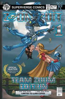
Superverse's Zoom Suit #1-4 Review


Whoever said that we didn’t need another hero was nuts.

Superverse Comics is the latest and greatest entry ready to duke it out with industry heavy-hitters…and they’ve come out swinging haymakers with their launch title: Zoom Suit.

Zoom Suit is a zany romp of a seemingly misplaced mantle of super-heroism placed upon an unpopular, unsuspecting and downtrodden teen whose life takes a wild upward swing for the better when he takes an alien suit and transforms into a super heroic dynamo. The series’ antagonists try to wrest the alien suit from Myles’ possession: One for megalomaniacal purposes and the other for reverse engineering their way into greater world dominance. (Don’t you hate it when people are like that?).

John Taddeo has written a story that starts out at a breakneck pace which never relents but keeps burning rubber until the series’ final page. I love the homage to Superman in the beginning when the suit arrives from the skies in the form of a mysterious, fallen alien ship. The “Ma and Pa Kent” characters have one of the most humorous interactions in comics. The first few pages alone are worth the price of admission. Taddeo has instilled into the comic a spirit of fun that just pulls you in from the get-go. Taddeo has a knack for writing humor that can be wry and dry or laugh out loud funny.

Zoom Suit takes the best elements of iconic themes and creates fun, zestful stories that grabs both your funny bone and your throat and doesn’t let go! Taddeo and Patton’s vision of the newly, christened Superverse with characters that literally zoom through its pages offers adventures (or misadventures) that promise to entertain readers for years to come. Reading Zoom Suit is some of the most fun I’ve had reading a comic that recalls my childhood memories of peeling open and taking in an early Lee/Ditko classic and enjoying every minute of it. Easily, the Comic Series of the Year!

So, go out and grab the entire set of Zoom Suit, issues 1-4. Then, take your seat and fasten your seat belt. And also make sure your seat back and folding trays are in trays are in their full upright position…’coz your ride is going to be wild and bumpy!!


(Originally published in TheComicsReview.com)

Arcana's Kade #1 Review


Kade is a child of the black sun. He is ageless and impervious to death and pain. His mission is to destroy the “fallen ones” or fallen angels who have the ability to possess other humans entrenched deep in grievous sin.


I’m a fan of storylines that entail fallen angels. One of the unique twists is that these fallen angels can actually possess human beings. Then again, fallen angels are tantamount to demons from hell, aren’t they? Most of the issue was set up for the rest of the storyline. Readers are brought up to speed fairly quickly through appropriately placed flashbacks. However, there were times the writing seemed a bit disjointed. One example involved Kade’s battle with a fallen-possessed priest. A woman joins the fray; however, she is never properly introduced and her name is never mentioned…yet, she carries on as if she’s known Kade for quite some time. My guess is that even though it’s numbered as #1, there were previous issues involving these characters. Either way, a first issue and its characters should be accessible for new readers.


The artwork by Sejic and Verma is fantastic. The splash page introducing Kade is impressive. The small panel showing the demon-possessed priest was one of the most frightening images you’ll see in a comic book. (I viewed that panel in a hotel on a cold, snowy night in Detroit, so perhaps the environment contributed to the overall spookiness. Nevertheless, it is one of comicdom’s creepiest portrayals of supernatural possession).

(Originally published in TheComicsReview.com)

Arcana's Koni Waves #1 Review


Koni Waves is a former nightclub pole dancer turned detective. The artwork by Sistilli and Weeks is clean and open. The artwork reminds me of the old Modesty Blaise comic strips of old with a Hawaii Five-0 twist. Sometimes, I feel that Jack Lord and Don Ho are going to pop up out of the woodwork in any of the pages.

The writing could be a lot better. The dialogue and panel-to-panel movement seemed stilted at times. The “cheesecake factor” isn’t really necessary and does nothing to move the story along. I was hoping that the creators would work against type and strive for a “Ms. Tree” in a tropical setting. I was wrong. This has the trappings of “Beach Blanket Babylon” trying unsuccessfully to be a “fun” murder mystery.

(Originally published in TheComicsReview.com)

Monday, October 16, 2006

Decoy: Menagerie Part 2

“I don’t like the Impossible Man”.

“I don’t like anthologies…especially those that feature various artists or writers”.

These are a couple of thoughts that ran through my mind as I stared at Penny-Farthing Press’ latest hardcover offering. I’ve loved everything I’ve read from PFP so far and I feared that this streak was going to come to an end.

Sometimes, I love it when I’m wrong as in the case of my aforementioned first impressions.

Decoy is a rather innocent-looking, green, meta-being or alien gifted with seemingly limitless powers to morph and shape into anything humanly imaginable. Decoy (whose name cannot be expressed with human vocal chords as it would cause your head to explode) is, thankfully, the complete opposite of his Marvelous counterpart. Decoy comes from a world who trains their males to be the ultimate alpha-creatures trained to dominate and enslave the universe. But, Decoy is different. Decoy, although fully-equipped with vast powers, is a creature with a sensitive heart. He is enjoined in a symbiotic relationship with a rookie police officer Bobby Luck. Luck takes Decoy along with him and the anthology details their myriad adventures.


“Decoy: Menagerie Part 2” is one of the best reads of the year. If you haven’t read Part 1, don’t let that scare you off as each story is self-contained and independent of each other. The stories are written and illustrated by an expertly chosen creative team of writers that are some of the best, brightest and up and coming talents in the industry. The varied artistic styles combine to portray a slice of life from the days in the lives of this dynamic duo. The stories range from the time-traveling fable to the gritty, inner city encounter to a family dinner at thanksgiving. This is truly an all-ages book at its best. Although it can be qualified as “all-ages”, the book’s stories don’t talk down to its audience. The stories can be fun-filled, adventurous and introspective.

“Decoy: Menagerie Part 2” is definitely a must-have book that every one of all ages can enjoy. Books such as this one are rare in today’s market as it remind me of all the things that are good about reading comics.

Monday, October 09, 2006

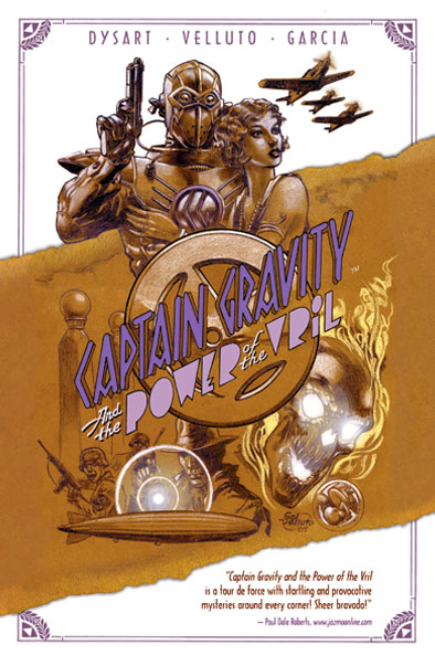
Captain Gravity and the Power of the Vril


Penny-Farthing Press is doing something that most, newly-established independent publishing companies are NOT doing: They’re creating stories of the fantastic that rival the best that the Big Three publishing houses have to offer.

“Captain Gravity and the Power of the Vril” should be a trade paperback on every comic book lovers’ shelves! It is a wild romp from the early Hollywood studios to the wind-swept sand dunes of ; from the streets of Berlin to the depths of Atlantis. From the first page to the last, readers are launched onto a fast-paced adventure that spans the globe and our imaginations and leaves them wanting more at the final turn of the last page.

Joshua Dysart’s writing is intelligent and well-versed. He depicts the best historical fiction of the time and embellishes well-known historical figures with intricate strokes of fine characterization. Even the most dastardly of characters can win over readers’ sympathies as Dysart expertly portrays and delves into the gradually unfolding past of the main villain’s life. I love how Dysart doesn’t portray the titular character in a minority stereotype of the period. Instead, we are drawn to Captain Gravity’s longing for love and passion for righting wrongs. Joshua Dysart is well-versed in American history and takes the most mind-boggling concepts of Nazi Germany’s attempts to rule the world to create a tightly-woven, well-constructed, exciting adventure filled with high concepts and high-octane action.

I’ve loved Sal Velluto’s excellent line work from his work from DC Comics. He is one of the most dynamic storytellers in the industry. One of my favorite pages portrays his unique cinematic story telling with the creative use of well-constructed panels. On page 73 there is a panel where Chase Dubois confronts a young Adolf Hitler for the first time. Their high-tensioned, confrontation is further highlighted by Velluto’s beautifully drawn panel which shows the reverse images of both Dubois and Hitler’s reflection on Hitler’s desk with the sharp, swastika-embossed letter opener dividing the two images.

Penny-Farthing Press is a force to be reckoned with in the comic book industry. They have created some of the best comic books on the market today. Moreover, they have not fallen into the trap of creative redundancy and have produced some of the most uniquely imaginative stories around. I’m grateful for their excellent production of trade paperbacks of recently collected stories. It gives a second chance for people like me who missed them on the first go-round to get caught up. Moreover, their reintroduction of the characters in this format gives me a chance not to make the mistake of missing anything that comes out from this publishing house in the future.

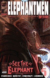
Elephantmen #1-3


Richard Starkings is a gentleman known throughout the comics industry as one of the pioneers of digital lettering that has subtly and greatly changed the face of the books we read today. However, I didn’t know that he was also a fantastic writer! Starkings writes an anthology of stories for his gritty, dark, sci-fi noir, Elephantmen, by Image Comics.


I’ll be honest. I have an aversion for talking animal comics in general, especially if they are presented in a real world setting. I never gave Elephantmen much more than a passing glance in the past. And, now I’m deeply regretting this decision.


The Elephantmen are the result of Doctor Kazushi Nikken’s wicked experiments creating human-animal hybrids. These hybrids are generally ostracized by human society despite their rather human tendencies. The Elephantmen is also general term for any human-animal hybrid which can include human hybrids with Crocodiles or Hippopotami.


Starkings does a great job of portraying the plight of the Elephantmen who want so desperately to acclimate with modern society. However, it appears that their general dislike may not only stem from their rather inhuman appearance, but also is rooted to their bloody pasts. The Elephantmen were initially bred and trained to be fighting machines that would show no mercy to their enemies. In the first issue, Starkings powerfully uses flashbacks to provide readers telltale snapshots of their bestial, warlike pasts. Starkings’ writing is both powerful and cinematic as it captures the baseness and brutality of their origins; as well as capturing our sympathies since they were trained to be this way and may not have wanted it in the beginning.


Much of the artwork is beautifully illustrated by Moritat. His line work can capture both the elegant and the brutal as he depicts the Elephantmen wreaking havoc against one another as in issue 2. Moritat’s artwork and colors further accentuate the density and volume of these human-animal hybrids as well as their sheer enormity and power as they dwarf their human counterparts. The imagery of a half-man, half-croc never hit me in the past as it did when seeing Elijah Delaney make a guest appearance at a shock radio studio.


The Elephantmen is truly sci-fi noir at its best. The undercurrent of fear and prejudice towards the unknown is powerfully used to heighten the tension of the human-animal hybrids in ways that the X-men could never portray. It is to their credit that Starkings and Moritat can effortlessly depict these inhuman beings in ways that can win over your sympathies or dredge up fearful imagery that make you pause for moment to catch your breath. The Elephantmen is not just sci-fi noir at its best; it’s an entertaining read that displays some of the best storytelling in the industry today…period.

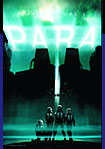
Para


I enjoy reading stories by writers who were once editors prior to their present career shift of being on the other side of the published pen. Although there is no hard & fast, accurate science to this other than the sales and public opinion, I find it interesting to see if the creative genius they used in guiding other creators to be their creative best applies with similar success on their own, personal work.

I’ve read books that Stuart Moore has edited for DC Comics in the past. This is my first time reading any of his personal work and “I’m lovin’ it”. The folks at Penny-Farthing Press have quite a formidable line up of new titles that seek to push the storytelling envelope. Stuart Moore’s Para is a sci-fi thriller guaranteed to keep you raving for more.

Most of the storyline of ''Para" takes place within the confines of an abandoned structure which houses an aged SuperCollider, the world's largest and most powerful particle accelerator. The daughter of the former lead scientist of the project, Sara Erie, has been having nightmarish dreams which provide cryptic clues explaining the death of her father which occurred many years ago while attending to the project. She embarks on a quest to find the true story behind the mysterious circumstances surrounding her father's death.

"Para" combines the alien, eeriness of The Outer Limits along with the spooky otherworldliness of The Final Destination and shakes it up with taut relational conflicts and dark, conspiratorial theories to create a combustive concoction of dynamic sci-fi storytelling. Moore is in his element as he culls from personal experiences with the scientific world to create a heightened, suspense-filled story that moves along at a pace fast enough to keep interest and intriguing enough to keep us in a state of wonderment.

The artwork is clean and open. There are panels that could’ve been a cinematic nightmare given the madness-inspired worlds that Moore creates, but the artists’ creative ingenuity keeps the story beautifully drawn and simply understood. Para is a definite “must read”.